Embed support widgets
Embed Widgets
Embed a Myhappr support card directly into your website or add a beautiful floating support button.
You can easily collect support on your own website, blog, or portfolio by embedding a Myhappr widget. We provide two types of widgets:
- Inline Embed: An interactive tip card that sits directly inside your page content, perfect for the bottom of blog posts or articles.
- Floating / Inline Button: A button that can either float fixed in the bottom corner of the screen, or be placed inline anywhere in your page layout (e.g., inside a hero section) using custom attributes. Clicking it opens the slide-out drawer containing your tip card.
Getting your Embed Code
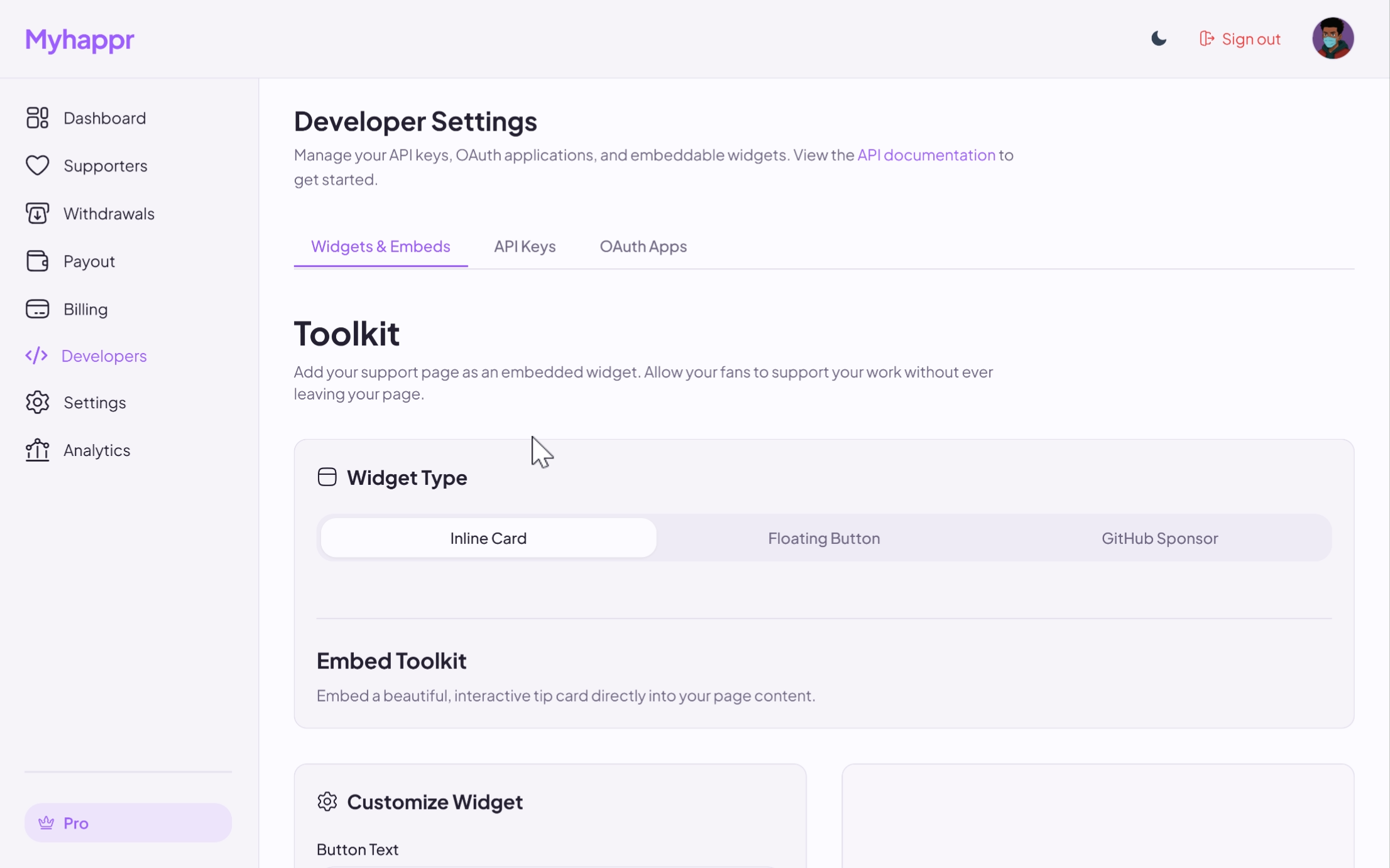
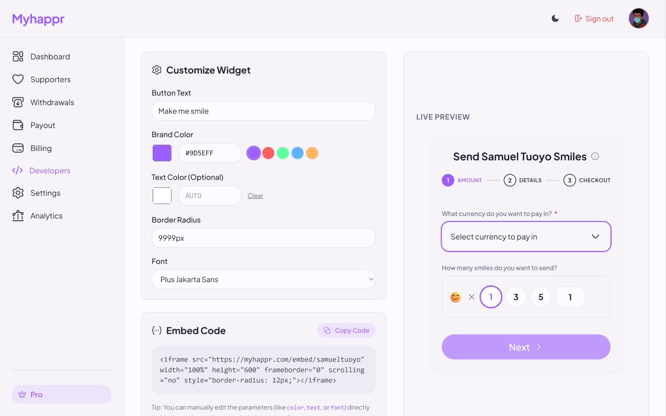
You don't need to write any code manually. Simply head to the Developer Settings on your dashboard, navigate to the Widgets & Embeds tab, and use the interactive configurator to customize your widget.
Adding the Inline Widget to your site
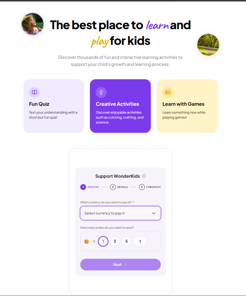
Paste the copied <iframe> code into your website's HTML wherever you want the tip card to appear.
<!DOCTYPE html>
<html lang="en">
<head>
<meta charset="UTF-8">
<meta name="viewport" content="width=device-width, initial-scale=1.0">
<title>WonderKids</title>
<link rel="preconnect" href="https://fonts.googleapis.com">
<link rel="preconnect" href="https://fonts.gstatic.com" crossorigin>
<link href="https://fonts.googleapis.com/css2?family=Plus+Jakarta+Sans:wght@400;500;600;700;800&family=Caveat:wght@700&display=swap" rel="stylesheet">
<style>
body {
font-family: 'Plus Jakarta Sans', -apple-system, BlinkMacSystemFont, sans-serif;
background-color: #ffffff;
color: #09090b;
margin: 0;
padding: 0;
}
.container {
max-width: 800px;
margin: 0 auto;
padding: 4rem 1.5rem;
text-align: center;
}
.hero-wrapper {
position: relative;
display: inline-block;
max-width: 600px;
margin: 0 auto;
}
.avatar-decor {
position: absolute;
width: 90px;
height: 90px;
border-radius: 50%;
overflow: hidden;
border: 4px solid #ffffff;
box-shadow: 0 4px 20px rgba(0, 0, 0, 0.08);
display: none; /* Hide on small screens */
}
@media (min-width: 768px) {
.avatar-decor {
display: block;
}
}
.avatar-decor.left {
top: -20px;
left: -110px;
transform: rotate(-10deg);
border-color: #e0d4fc;
}
.avatar-decor.right {
bottom: -10px;
right: -110px;
transform: rotate(8deg);
border-color: #fef3c7;
}
.avatar-decor img {
width: 100%;
height: 100%;
object-fit: cover;
}
h1 {
font-size: 3rem;
font-weight: 800;
letter-spacing: -0.02em;
line-height: 1.15;
margin: 0 0 1.5rem 0;
color: #09090b;
}
.highlight {
font-family: 'Caveat', cursive;
font-size: 3.5rem;
font-weight: 700;
display: inline-block;
transform: rotate(-1deg);
}
.highlight.purple {
color: #7c3aed;
}
.highlight.yellow {
color: #eab308;
}
p.lead {
font-size: 1.1rem;
color: #71717a;
line-height: 1.6;
max-width: 560px;
margin: 0 auto 3rem auto;
}
.grid {
display: grid;
grid-template-columns: repeat(auto-fit, minmax(220px, 1fr));
gap: 1.5rem;
margin-bottom: 4rem;
text-align: left;
}
.card {
border-radius: 24px;
padding: 2rem 1.5rem;
display: flex;
flex-direction: column;
gap: 0.75rem;
}
.card.lavender {
background-color: #f0ebff;
color: #09090b;
}
.card.purple {
background-color: #7c3aed;
color: #ffffff;
}
.card.yellow {
background-color: #fef3c7;
color: #09090b;
}
.icon-container {
width: 44px;
height: 44px;
display: flex;
align-items: center;
justify-content: center;
border-radius: 50%;
}
.card.lavender .icon-container {
background-color: #e0d4fc;
color: #7c3aed;
}
.card.purple .icon-container {
background-color: rgba(255, 255, 255, 0.2);
color: #ffffff;
}
.card.yellow .icon-container {
background-color: #fde68a;
color: #d97706;
}
.card h3 {
font-size: 1.25rem;
font-weight: 700;
margin: 0;
color: inherit;
}
.card p {
font-size: 0.875rem;
margin: 0;
line-height: 1.5;
opacity: 0.9;
color: inherit;
}
.widget-container {
border: 1px solid #e4e4e7;
border-radius: 20px;
overflow: hidden;
background-color: #ffffff;
box-shadow: 0 4px 20px rgba(0, 0, 0, 0.04);
max-width: 420px;
margin: 0 auto;
}
</style>
</head>
<body>
<main class="container">
<div class="hero-wrapper">
<div class="avatar-decor left">
<img src="https://images.unsplash.com/photo-1503454537195-1dcabb73ffb9?auto=format&fit=crop&w=150&h=150&q=80" alt="Kid learning">
</div>
<h1>The best place to <span class="highlight purple">learn</span> and <span class="highlight yellow">play</span> for kids</h1>
<div class="avatar-decor right">
<img src="https://images.unsplash.com/photo-1519331379826-f10be5486c6f?auto=format&fit=crop&w=150&h=150&q=80" alt="Kid playing">
</div>
</div>
<p class="lead">
Discover thousands of fun and interactive learning activities to support your child's growth and learning process.
</p>
<div class="grid">
<div class="card lavender">
<div class="icon-container">
<svg xmlns="http://www.w3.org/2000/svg" width="22" height="22" viewBox="0 0 24 24" fill="none" stroke="currentColor" stroke-width="2" stroke-linecap="round" stroke-linejoin="round"><path d="M2 3h6a4 4 0 0 1 4 4v14a3 3 0 0 0-3-3H2z"/><path d="M22 3h-6a4 4 0 0 0-4 4v14a3 3 0 0 1 3-3h7z"/></svg>
</div>
<h3>Fun Quiz</h3>
<p>Test your understanding with a short but fun quiz!</p>
</div>
<div class="card purple">
<div class="icon-container">
<svg xmlns="http://www.w3.org/2000/svg" width="22" height="22" viewBox="0 0 24 24" fill="none" stroke="currentColor" stroke-width="2" stroke-linecap="round" stroke-linejoin="round"><path d="M15 14c.2-1 .7-1.7 1.5-2.5 1-.9 1.5-2.2 1.5-3.5A5 5 0 0 0 8 8c0 1 .3 2.2 1.5 3.5.7.7 1.3 1.5 1.5 2.5h4Z"/><path d="M9 18h6"/><path d="M10 22h4"/></svg>
</div>
<h3>Creator Activities</h3>
<p>Discover enjoyable activities such as coloring, crafting, and science.</p>
</div>
<div class="card yellow">
<div class="icon-container">
<svg xmlns="http://www.w3.org/2000/svg" width="22" height="22" viewBox="0 0 24 24" fill="none" stroke="currentColor" stroke-width="2" stroke-linecap="round" stroke-linejoin="round"><rect x="2" y="6" width="20" height="12" rx="2"/><path d="M6 12h4"/><path d="M8 10v4"/><line x1="15" y1="13" x2="15.01" y2="13"/><line x1="18" y1="11" x2="18.01" y2="11"/></svg>
</div>
<h3>Learn with Games</h3>
<p>Learn something new while playing games!</p>
</div>
</div>
<div class="widget-container">
<!-- Myhappr Inline Widget -->
<iframe
src="https://myhappr.com/embed/your-username?color=%237c3aed&title=Support+WonderKids&theme=dark"
width="100%"
height="600"
frameborder="0"
scrolling="auto"
style="border: none; display: block;"
></iframe>
</div>
</main>
</body>
</html>
Adding the Floating Button (Fixed Corner) to your site
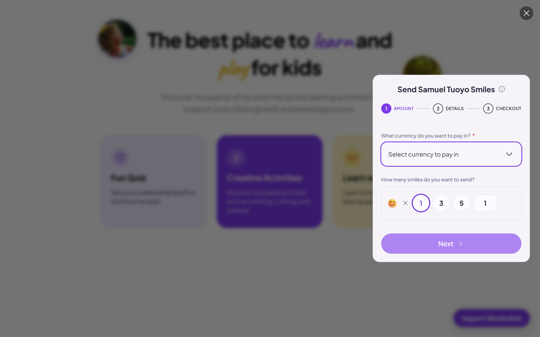
Paste the copied <script> tag just before the closing </body> tag of your website's HTML, or load it inside your React/Next.js layout component. The button will automatically position itself in the bottom right corner of the viewport.
<!DOCTYPE html>
<html lang="en">
<head>
<meta charset="UTF-8">
<meta name="viewport" content="width=device-width, initial-scale=1.0">
<title>WonderKids</title>
<link rel="preconnect" href="https://fonts.googleapis.com">
<link rel="preconnect" href="https://fonts.gstatic.com" crossorigin>
<link href="https://fonts.googleapis.com/css2?family=Plus+Jakarta+Sans:wght@400;500;600;700;800&family=Caveat:wght@700&display=swap" rel="stylesheet">
<style>
body {
font-family: 'Plus Jakarta Sans', -apple-system, BlinkMacSystemFont, sans-serif;
background-color: #ffffff;
color: #09090b;
margin: 0;
padding: 0;
}
.container {
max-width: 800px;
margin: 0 auto;
padding: 4rem 1.5rem;
text-align: center;
}
.hero-wrapper {
position: relative;
display: inline-block;
max-width: 600px;
margin: 0 auto;
}
.avatar-decor {
position: absolute;
width: 90px;
height: 90px;
border-radius: 50%;
overflow: hidden;
border: 4px solid #ffffff;
box-shadow: 0 4px 20px rgba(0, 0, 0, 0.08);
display: none; /* Hide on small screens */
}
@media (min-width: 768px) {
.avatar-decor {
display: block;
}
}
.avatar-decor.left {
top: -20px;
left: -110px;
transform: rotate(-10deg);
border-color: #e0d4fc;
}
.avatar-decor.right {
bottom: -10px;
right: -110px;
transform: rotate(8deg);
border-color: #fef3c7;
}
.avatar-decor img {
width: 100%;
height: 100%;
object-fit: cover;
}
h1 {
font-size: 3rem;
font-weight: 800;
letter-spacing: -0.02em;
line-height: 1.15;
margin: 0 0 1.5rem 0;
color: #09090b;
}
.highlight {
font-family: 'Caveat', cursive;
font-size: 3.5rem;
font-weight: 700;
display: inline-block;
transform: rotate(-1deg);
}
.highlight.purple {
color: #7c3aed;
}
.highlight.yellow {
color: #eab308;
}
p.lead {
font-size: 1.1rem;
color: #71717a;
line-height: 1.6;
max-width: 560px;
margin: 0 auto 3rem auto;
}
.grid {
display: grid;
grid-template-columns: repeat(auto-fit, minmax(220px, 1fr));
gap: 1.5rem;
margin-bottom: 4rem;
text-align: left;
}
.card {
border-radius: 24px;
padding: 2rem 1.5rem;
display: flex;
flex-direction: column;
gap: 0.75rem;
}
.card.lavender {
background-color: #f0ebff;
color: #09090b;
}
.card.purple {
background-color: #7c3aed;
color: #ffffff;
}
.card.yellow {
background-color: #fef3c7;
color: #09090b;
}
.icon-container {
width: 44px;
height: 44px;
display: flex;
align-items: center;
justify-content: center;
border-radius: 50%;
}
.card.lavender .icon-container {
background-color: #e0d4fc;
color: #7c3aed;
}
.card.purple .icon-container {
background-color: rgba(255, 255, 255, 0.2);
color: #ffffff;
}
.card.yellow .icon-container {
background-color: #fde68a;
color: #d97706;
}
.card h3 {
font-size: 1.25rem;
font-weight: 700;
margin: 0;
color: inherit;
}
.card p {
font-size: 0.875rem;
margin: 0;
line-height: 1.5;
opacity: 0.9;
color: inherit;
}
</style>
</head>
<body>
<main class="container">
<div class="hero-wrapper">
<div class="avatar-decor left">
<img src="https://images.unsplash.com/photo-1503454537195-1dcabb73ffb9?auto=format&fit=crop&w=150&h=150&q=80" alt="Kid learning">
</div>
<h1>The best place to <span class="highlight purple">learn</span> and <span class="highlight yellow">play</span> for kids</h1>
<div class="avatar-decor right">
<img src="https://images.unsplash.com/photo-1519331379826-f10be5486c6f?auto=format&fit=crop&w=150&h=150&q=80" alt="Kid playing">
</div>
</div>
<p class="lead">
Discover thousands of fun and interactive learning activities to support your child's growth and learning process.
</p>
<div class="grid">
<div class="card lavender">
<div class="icon-container">
<svg xmlns="http://www.w3.org/2000/svg" width="22" height="22" viewBox="0 0 24 24" fill="none" stroke="currentColor" stroke-width="2" stroke-linecap="round" stroke-linejoin="round"><path d="M2 3h6a4 4 0 0 1 4 4v14a3 3 0 0 0-3-3H2z"/><path d="M22 3h-6a4 4 0 0 0-4 4v14a3 3 0 0 1 3-3h7z"/></svg>
</div>
<h3>Fun Quiz</h3>
<p>Test your understanding with a short but fun quiz!</p>
</div>
<div class="card purple">
<div class="icon-container">
<svg xmlns="http://www.w3.org/2000/svg" width="22" height="22" viewBox="0 0 24 24" fill="none" stroke="currentColor" stroke-width="2" stroke-linecap="round" stroke-linejoin="round"><path d="M15 14c.2-1 .7-1.7 1.5-2.5 1-.9 1.5-2.2 1.5-3.5A5 5 0 0 0 8 8c0 1 .3 2.2 1.5 3.5.7.7 1.3 1.5 1.5 2.5h4Z"/><path d="M9 18h6"/><path d="M10 22h4"/></svg>
</div>
<h3>Creator Activities</h3>
<p>Discover enjoyable activities such as coloring, crafting, and science.</p>
</div>
<div class="card yellow">
<div class="icon-container">
<svg xmlns="http://www.w3.org/2000/svg" width="22" height="22" viewBox="0 0 24 24" fill="none" stroke="currentColor" stroke-width="2" stroke-linecap="round" stroke-linejoin="round"><rect x="2" y="6" width="20" height="12" rx="2"/><path d="M6 12h4"/><path d="M8 10v4"/><line x1="15" y1="13" x2="15.01" y2="13"/><line x1="18" y1="11" x2="18.01" y2="11"/></svg>
</div>
<h3>Learn with Games</h3>
<p>Learn something new while playing games!</p>
</div>
</div>
</main>
<!-- Myhappr Floating Widget -->
<script
src="https://myhappr.com/widget.js"
data-username="your-username"
data-color="#7c3aed"
data-button-color="#9D5EFF"
data-text-color="#ffffff"
data-radius="9999px"
data-text="Support WonderKids"
data-title="Support WonderKids"
data-theme="dark"
data-theme="light"
data-card-bg="#ffffff"
data-card-text="#09090b"
></script>
</body>
</html>
Adding the Inline Button (Custom Placement) to your site
If you want the button to float in the page flow rather than sticking to the bottom-right corner, you can place a standard button element with data-myhappr-username attributes anywhere in your container layout. You can also customize the brand color, border radius, text, and title parameters dynamically.
<!DOCTYPE html>
<html lang="en">
<head>
<meta charset="UTF-8">
<meta name="viewport" content="width=device-width, initial-scale=1.0">
<title>WonderKids</title>
<link rel="preconnect" href="https://fonts.googleapis.com">
<link rel="preconnect" href="https://fonts.gstatic.com" crossorigin>
<link href="https://fonts.googleapis.com/css2?family=Plus+Jakarta+Sans:wght@400;500;600;700;800&family=Caveat:wght@700&display=swap" rel="stylesheet">
<style>
body {
font-family: 'Plus Jakarta Sans', -apple-system, BlinkMacSystemFont, sans-serif;
background-color: #ffffff;
color: #09090b;
margin: 0;
padding: 0;
}
.container {
max-width: 800px;
margin: 0 auto;
padding: 4rem 1.5rem;
text-align: center;
}
.hero-wrapper {
position: relative;
display: inline-block;
max-width: 600px;
margin: 0 auto;
}
.avatar-decor {
position: absolute;
width: 90px;
height: 90px;
border-radius: 50%;
overflow: hidden;
border: 4px solid #ffffff;
box-shadow: 0 4px 20px rgba(0, 0, 0, 0.08);
display: none; /* Hide on small screens */
}
@media (min-width: 768px) {
.avatar-decor {
display: block;
}
}
.avatar-decor.left {
top: -20px;
left: -110px;
transform: rotate(-10deg);
border-color: #e0d4fc;
}
.avatar-decor.right {
bottom: -10px;
right: -110px;
transform: rotate(8deg);
border-color: #fef3c7;
}
.avatar-decor img {
width: 100%;
height: 100%;
object-fit: cover;
}
h1 {
font-size: 3rem;
font-weight: 800;
letter-spacing: -0.02em;
line-height: 1.15;
margin: 0 0 1.5rem 0;
color: #09090b;
}
.highlight {
font-family: 'Caveat', cursive;
font-size: 3.5rem;
font-weight: 700;
display: inline-block;
transform: rotate(-1deg);
}
.highlight.purple {
color: #7c3aed;
}
.highlight.yellow {
color: #eab308;
}
p.lead {
font-size: 1.1rem;
color: #71717a;
line-height: 1.6;
max-width: 560px;
margin: 0 auto 2rem auto;
}
.hero-actions {
display: flex;
justify-content: center;
gap: 1rem;
margin-bottom: 4rem;
}
</style>
</head>
<body>
<main class="container">
<div class="hero-wrapper">
<div class="avatar-decor left">
<img src="https://images.unsplash.com/photo-1503454537195-1dcabb73ffb9?auto=format&fit=crop&w=150&h=150&q=80" alt="Kid learning">
</div>
<h1>The best place to <span class="highlight purple">learn</span> and <span class="highlight yellow">play</span> for kids</h1>
<div class="avatar-decor right">
<img src="https://images.unsplash.com/photo-1519331379826-f10be5486c6f?auto=format&fit=crop&w=150&h=150&q=80" alt="Kid playing">
</div>
</div>
<p class="lead">
Discover thousands of fun and interactive learning activities to support your child's growth and learning process.
</p>
<div class="hero-actions">
<!-- Myhappr Floating Widget (Inline Mode) -->
<script
src="https://myhappr.com/widget.js"
data-username="your-username"
data-color="#7c3aed"
data-button-color="#9D5EFF"
data-text-color="#ffffff"
data-radius="9999px"
data-text="Support WonderKids"
data-title="Support WonderKids"
data-theme="dark"
data-theme="light"
data-card-bg="#ffffff"
data-card-text="#09090b"
data-inline="true"
></script>
</div>
</main>
</body>
</html>Widget Parameters Explained
Here is a simple list of all the custom parameters you can add to your code snippet to change how the widget looks and behaves:
data-username(ordata-myhappr-usernamefor custom buttons) is your unique Myhappr username. This tells our system exactly who should receive the tips.data-coloris the main brand color for the support card. It is used for buttons, highlight outlines, and active elements. You can pass any standard color code like a hex color.data-text-colorallows you to choose a custom color for the text inside your trigger button. If you leave it out, our system will automatically choose white or black depending on which gives the best readability against your brand color.data-radiuscontrols how rounded the corners of your button are. You can use values like 9999px for a fully pill-shaped button, 8px for slightly rounded corners, or 0px for perfectly sharp square corners.data-textis the text message written on your trigger button.data-fontlets you choose a font that matches your branding. You can select clean modern fonts like Inter, Outfit, Roboto, Plus Jakarta Sans, Geist, or Playfair Display. If you don't define this, the widget will dynamically adapt and inherit the exact font used on your website.data-titleis a custom title displayed at the top of the tip card. If you want to say something personal like "Support WonderKids", you can pass that text here.data-theme(or thethemeparameter on iframes) sets the color scheme of the sliding drawer or card. You can passlightordark, or you can even supply your own custom hexadecimal background color code (such as#1a1b26). If you supply a dark custom color, our system automatically shifts the card content into dark mode text and styling to ensure perfect readability.
How the Slide-out Drawer Works
When a supporter clicks either the Floating or Inline Button, the widget loader dynamically slides a drawer into view from the right side of the screen. Under the hood, this drawer is engineered for optimal performance, user experience, and security:
- Instant Preloading: The iframe is injected and loaded in the background as soon as the host page loads, ensuring that the tip card appears instantly without delay when the button is clicked.
- Premium Aesthetics & Transitions: The drawer overlay utilizes a darkened background with a modern blur effect (
backdrop-filter: blur(4px)) and smooth slide animations (translateXtransitions) for a native app-like experience. - Page Scroll Lock: While the drawer is active, scrolling on the host page is automatically disabled (
overflow: hiddenon the document body) to prevent accidental layout shifts or double-scrolling. - Accessibility & Keyboard Support: Supports keyboard standards. Pressing the
Escapekey or clicking outside the drawer instantly closes it, returning focus back to the button. - Smart Form Reset: Upon closing the drawer, a secure message is sent to the iframe to reset the support form state. This ensures that the next time the button is clicked, supporters see a clean form without reloading the iframe.
- Sandbox Protection: The iframe uses a strict
sandboxconfiguration, allowing only necessary integrations (scripts, forms, popups, and top-level redirect actions for payment checkouts) to keep your host site completely secure.